Warning!, if you have couple of tattoos in your body, this is not the right place. You certainly have more in depth knowledge, fancy portfolio and you have to express that. These questions are for lazy intermediate JS developers to get the job by creating an illusion of familiarity with css---
List of Questions
- what does float do?
- How can you clear sides of a floating element?
- How can you clear sides of a floating element?
- some tricky questions in rapid fire style
- Does css properties are case sensitive?
- Why css selectors mixed up with cases don't apply the styles?
- Does margin-top or margin-bottom has effect on inline element?
- Does padding-top or padding-bottom has effect on inline element?
- Does padding-left or padding-right or margin-left or margin-right has effect on inline element?
- If you have a <p> element with font-size: 10rem, will the text be responsive when the user resizes / drags the browser window?
- The pseudo class :checked will select inputs with type radio or checkbox, but not
- In a HTML document, the pseudo class :root always refers to the element.
- The translate() function can move the position of an element on the z-axis.
- Which one would you prefer among px, em % or pt and why?
- How absolute, relative, fixed and static position differ?
- What are the differences between visibility hidden and display none?
- What are the differences between inline, block and inline-block?
- What are the properties related to box model?
- Does overflow: hidden create a new block formatting context?
- How could you apply css rules specific to a media?
- What is the use of only?
- Does the screen keyword apply to the device's physical screen or the browser's viewport?
- What are the some pseudo classed u have used?
- How do you align a p center-center inside a div?
- How do you optimize css selectors?
- How can you load css resources conditionally?
- Why would you use sprites?
- What is specificity? How do u calculate specificity?
- What is shadow DOM?
- What do you know about transition?
- What are the different css filter you can use?
- What are the reasons to use preprocessor?
- Show you couple of style example and you have to tell what does it do.
Deleted Scenes!
Looks like these are for hardcore designer folks. Hence, didn't make in for developers.
- How descendant css selectors are matched? get answer
- How would u implement modularity in css?
- If something doesn't work in a specific browser (IE8), you would u approach this problem?
- How do you test cross-browser compatibility of your site?
- What is the greatest hack you did in css so far?
- What is grid layout?
- How can you make a site responsive?
- Why reset css is useful? or how normalize.css works?
- What do you know about text shadows, box shadows?
Need more: HTML Interview Questions, JavaScript Beginners Algorithm
1. float
Question: What does float do?
Answer: float pushes an element to the sides of a page with text wrapped around it. you can create entire page or a smaller area by using float. if size of a floated element changes, text around it will re-flow to accommodate the changes. You can have float left, right, none or inherit.
if you set, 'float: left;' for an image, it will move to the left until the margin, padding or border of another block-level element is reached. The normal flow will wrap around on the right side.
 <style>
   .floatContainer{
        width: 200px;
        height: 100px;
        border: 2px solid purple;
   }
   .box{
        float: left;
        width: 50px;
        height: 30px;
        border: 2px solid gray;
        margin: 5px;
   }
 </style>
 <div class="container">
    <div class="box"><span>1</span></div>
    <div class="box"><span>2</span></div>
    <div class="box"><span>3</span></div>
    <div class="box"><span>4</span></div>
    <div class="box"><span>5</span></div>
  </div>
If interviewer wants to ask one question about css, it will be most likely about float.
extra: read the positioning constraints in W3.org: floating elements.
ref: css-tricks: float, float 1012. clear
Question: How can you clear sides of a floating element?
Answer: If you clear a slide of an element, floating elements will not be accepted on that side. With 'clear' set to 'left', an element will be moved below any floating element on the left side. clear is used to stop wrap of an element around a floating element.
 <style>
   .clearLeft{
      clear: left;
   }
 </style>
 <div class="container">
    <div class="box"><span>1</span></div>
    <div class="box clearLeft"><span>2</span></div>
    <div class="box"><span>3</span></div>
    <div class="box"><span>4</span></div>
    <div class="box"><span>5</span></div>
  </div>
as clear left is applied to the second box. no other elements would be on the left of that box and hence it is placed in a new row.
Question: How can you fix, "floated points don't add up to the height of a parent"?
Answer: You can use clear: both in an empty div <div style="clear: both;"></div>, you can use overflow hidden or scroll and you can float the parent as well.
What the heck? Sorry. if you didn't get the question or answer, please read "Techniques for clearing floats" in css-tricks: all about floats
ref: W3.org: clear
3. rapid fire
Question: Are css properties case sensitive?
Answer: no.
Question: Are css selectors (id and classes) case sensitive?
Answer: yes.
Question: Do the properties margin-top and margin-bottom have an effect on inline element?
Answer: no.
Question: Do the properties padding-top and padding-bottom have an effect on inline element?
Answer: no.
Question: Do the properties padding-left, padding-right, margin-left and margin-right have an effect on inline element?
Answer: yes.
Question: If you have a <p> element with font-size: 10rem, will the text be responsive when the user resizes / drags the browser window?
Answer: no.
Question: The pseudo class :checked will select inputs with type radio or checkbox, but not <option> elements.
Answer: False
Question: In a HTML document, the pseudo class :root always refers to the <html> element.
Answer: True
Question: The translate() function can move the position of an element on the z-axis.
Answer: False
4. units
Question: Which one of these units would you prefer: px, em % or pt and why?
Answer: it depends on what you are trying to do.
px gives fine grained control and maintains alignment because 1 px or multiple of 1 px is guaranteed to look sharp. px is not cascade, this means if parent font-size is 20px and child 16px. child would be 16px.
em maintains relative size. you can have responsive fonts. em is the width of the letter 'm' in the selected typeface. However, this concept is tricky. 1em is equal to the current font-size of the element or the browser default. if u sent font-size to 16px then 1em = 16px. The common practice is to set default body font-size to 62.5% (equal to 10px). em is cascade
% sets font-size relative to the font size of the body. Hence, you have to set font-size of the body to a reasonable size. this is easy to use and does cascade. for example, if parent font-size is 20px and child font-size is 50%. child would be 10px.
pt(points) are traditionally used in print. 1pt = 1/72 inch and it is fixed-size unit.
ref: css-tricks: length, css-tricks: px, em, %, css font-size
5. position
Question: How do absolute, relative, fixed and static position differ?
Answer:
absolute, place an element exactly where you want to place it. absolute position is actually set relative to the element's parent. if no parent available then relatively place to the page itself.
relative, is position an element relative to itself (from where the element would be placed, if u don't apply relative positioning). for example, if u set position relative to an element and set top: 10px, it will move 10px down from where it would be normally.
fixed, element is positioned relative to viewport or the browser window itself. viewport doesn't changed if u scroll and hence fixed element will stay right in the same position.
static, element will be positioned based on the normal flow of the document. usually, u will use position static to remove other position might be applied to an element.
ref: css positioning in ten steps, css position, MDN: position
6. display vs visibility
Question: What are the differences between visibility hidden and display none?
Answer: display: none removes the element from the normal layout flow and allow other elements to fill in. visibility: hidden tag is rendered, it takes space in the normal flow but doesn't show it.
if u want to say it smartly, display: none causes DOM reflow where as visibility: hidden doesn't. btw, what is re-flow? answer. sorry i wont tell you, google it.
7. inline block
Question: What are the differences between inline, block and inline-block?
Answer:
inline, elements do not break the flow. think of span it fits in the line. Important points about inline elements, margin/ padding will push other elements horizontally not vertically. Moreover, inline elements ignores height and width.
block, breaks the flow and dont sits inline. they are usually container like div, section, ul and also text p, h1, etc.
inline-block, will be similar to inline and will go with the flow of the page. Only differences is this this will take height and width.
ref: display
8. box model
Question: What are the properties related to box model?
Answer: Technically, height, width, padding and border are part of box model and margin is related to it.
Extra: Everything in a web page is a box where you can control size, position, background, etc. Each box/ content area is optionally surrounded by padding, border and margin. When you set height and width of an element, you set content height and width.
ref: W3: box model, css box model, Whats wrong with box model
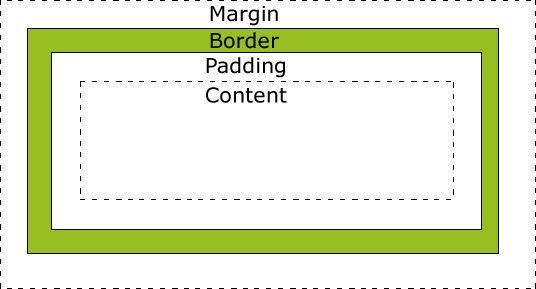
ref: image taken from google search
9. overflow
Question: Does overflow: hidden create a new block formatting context?
Answer: yes
Extra: overflow property deals with the content if content size exceeds the allocated size for the content. You can make extra content visible, hidden, scroll or auto (viewport default behavior).
overflow: visible This is some simple content to see how overflow works when you have too many things to say in a too small space. But don't be the person who just say rather be the person who does. does something for himself and others.
overflow: hidden This is some simple content to see how overflow works when you have too many things to say in a too small space. But don't be the person who just say rather be the person who does. does something for himself and others.
overflow: scroll This is some simple content to see how overflow works when you have too many things to say in a too small space. But don't be the person who just say rather be the person who does. does something for himself and others.
overflow: auto This is some simple content to see how overflow works when you have too many things to say in a too small space. But don't be the person who just say rather be the person who does. does something for himself and others.
ref: overflow (read the link and add something from it)
10. media queries
Question: How could you apply css rules specific to a media?
Answer: @media (max-width: 700px){...} means you want to apply rules to those media whose max-width is 700 px. this means every smaller device will have this rule.
@media (max-width: 700px) and (orientation: landscape){...} will apply rules for media smaller than 700px and in landscape orientation.
Question: What is the use of only?
Answer: to hide style sheets from older user agents.
Question: Does the screen keyword apply to the device's physical screen or the browser's viewport?
Answer: Browser's Viewport
ref: how to use media queries, css media queries, W3: media queries
11. pseudo class
Question: What are the some pseudo classed u have used?
Answer: pseudo class tells you specific state of an element. allow to style element dynamically. The most popular one is :hover. Besides i have used :visited, :focus, :nth-child, nth-of-type, :link, etc.
pseudo classes is better if you don't want to mess up with javaScript however, pseudo-classes is slow to process and apply rules.
ref: How to use pseudo classes, meet pseudo classes, list of pseudo classes
pseudo elements
pseudo elements helps you to add cosmetics contents. pseudo elements generates content where as pseudo class deals with state of the element. for example, you can style :first-letter of every paragraph. similarly, :first-line and fancy stuff with :before, :after
<style>
   p:before{
     content: "Starting of Paragraph: ";
     font-weight: bolder;
     color: purple;
   }
</style>
<p>First Paragraph with some content.</p>
<p>Second Paragraph with something else.</p>
First Paragraph with some content.
Second Paragraph with something else.
ref: intro to css pseudo element, :before :after, css content, W3: generate content
12. vertical Center
Question: How do you align a p center-center inside a div?
Answer: text-align: centerwill do the horizontal alignment but vertical-align: middle will not work here. there are couple of different ways to solve this problem and one of them are positioning. You make the parent as relative position and child as absolute positioning. And then define all position parameter as sero and width 50% and height 30% (sounds messy look at the example and read ref)
<style>
   .divContainer{
      height: 100px;
      border: 2px solid gray;
      text-align: center;
      position: relative;
   }
   p{
      position: absolute;
      top: 0;
      bottom: 0;
      left: 0;
      right: 0;
      width: 50%;
      height: 30%;
      margin: auto;
    }
</style>
<div class = "divContainer">
  <p>content example</p>
</div>
content example
ref: 6 methods for vertical center, Absolute horizontal and vertical centering
13. optimize selector
Question: How do you optimize css selectors?
Answer: This is very open and depend on what you are trying to achieve. If i order selectors in terms of render speed it would be like id, class, tag, siblings, child, descendant, universal, attribute, pseudo. Speed of ID and class is very close. However your code should be readable, maintainable and DRY along with highly performant.
The best practices in general are: avoid universal selectors, don't repeat yourself, remove redundant selectors, be as specific as possible, and keep learning.
14. @import
Question: How can you load css resources conditionally?
Answer: @import allows you to load/ import stylesheet by using a path (uri) representing the location of the file. You can define one or more media by comma separation for which you want to load the stylesheet. If browser dont support the media stylesheet will not be loaded.
ref: be careful while using @import (don't use @import)
15. sprite
Question: Why would you use sprites?
Answer: When you have multiple images/ icons, browser makes separate call to the server for each one of them. sprite is a technique to combine all/ some of them (usually similar one in terms of type of image. For example, you will put jpg in one sprite) in one image. To display the icon you set height, width and background position.
popular libraries like bootstrap use this technique. If you repeat the image. want to scale you have to be careful with sprite.
ref: css sprites, generate sprites
16. specificity
Question: What is specificity? How do u calculate specificity?
Answer: is a process of determining which css rule will be applied to an element. it actually determines which rules will take precedence.
inline style usually wins then ID then class value (or pseudo-class or attribute selector), universal selector (*) has no specificity.
ref: css specificity: things you need to know, specifishity, specificity calculator
17. shadow DOM
Question: What is shadow DOM?
Answer: encapsulate part of a DOM. hide subtree. you can have same ID in different shadow DOM. Polymers uses it. This way your DOM becomes reusable. if interviewer is not happy with your answer give him the links and tell him to spend a weekend on reading.
18. transition
Question: What do you know about transition?
Answer: transition allows to add an effect while changing from one style to another. You can set the which property you want to transition, duration, how you want to transit (linear, ease, ease-in, ease-out, cubic-bezier) and delay when transition will start. you can transition more than one property by comma separation
.transition {
    transition: [transition-property] [transition-duration] [transition-timing-function] [transition-delay];
}
.element {
  width: 50px;
  background-color: purple;
  transition: width  2s linear 0.5s, background-color 2s linear 0.5s;
}

.element:hover {
  width: 100px;
  background-color: red;
}
Hover over the purple box and wait. also move the out ur mouse.
Advanced: you can check transform: css 2D 3D transform, flip an image
ref: all you need to know about css transition, transition: tutorial, css transition, transition and 3D
19. filter
Question: What are the different css filter you can use?
Answer: css filter allows u to render DOM element, image, or video. u can choose from: grayscale, blur, opacity, brightness, contrast.

20. pre processor
Question: What are the reasons to use preprocessor?
Answer: you write css in high level with some special syntax (declaring variable, nested syntax, mathematical operations, etc.) and that is compiled to css. Preprocessor helps you to speed up develop, maintain, ensure best practices and also confirms concatenation, compression, etc.
ref: css preprocessor, working with preprocessor21. see & tell
Question: What would be the color of text "I am awesome" for the following rules?
html: for questions a-d.
<ul class="shopping-list" id="awesome">
    <li><span>Milk</span></li>
    <li class="favorite" id="must-buy"><span class="highlight">I am awesome</span></li>
</ul>
<style>
  ul#awesome {
    color: red;
  }
  ul.shopping-list li.favorite span {
    color: blue;
  }
</style>
Answer: blue
b.
<style>
 ul#awesome #must-buy {
    color: red;
 }
 .favorite span {
    color: blue!important;
 }
</style>
Answer: blue
c.
<style>
  ul.shopping-list li .highlight {
    color: red;
  }
  ul.shopping-list li .highlight:nth-of-type(odd) {
    color: blue;
  }
</style>
Answer: blue
d.
<style>
  #awesome .favorite:not(#awesome) .highlight {
    color: red;
  }
  #awesome .highlight:nth-of-type(1):nth-last-of-type(1) {
    color: blue;
  }
</style>
Answer: red
Position related
Question: What will happen to the position of #myDude?
<style>
  #myDude {
    margin-bottom: -5px;
  }
</style>
<p id="myDude">Dude</p>
Answer: All elements succeeding #myDude will move 5px updward.
reason: .
<style>
  #myDude {
    margin-left: -5px;
  }
</style>
<p id="myDude">Dude</p>
Answer: #myDude will move 5px left.
download resources
Question: On page load, will mypic.jpg get downloaded by the browser?.
<style>
  #test2 {
    background-image: url('mypic.jpg');
    display: none;
  }
</style>
<div id="test1">
    <span id="test2"></span>
</div>
Answer: yes.
Question: On page load, will mypic.jpg get downloaded by the browser?
<style>
  #test1 {
    display: none;
  }
  #test2 {
    background-image: url('mypic.jpg');
    visibility: hidden;
  }
</style>
<div id="test1">
    <span id="test2"></span>
</div>
Answer: No.
read selector
Question: What will this selector do?
[role=navigation] > ul a:not([href^=mailto]) {

}
Answer: This selects anchor links that are not email links that are decedents of an unordered list that is the direct child of any element with a role attribute of 'navigation'. this answer copied from css tricks
ref: show & tell is mostly based on David Shariff: quizNeed more: HTML Interview Questions, JavaScript Beginners Algorithm
Express anger!
Feel free to express your anger (sorry folks, you have to use g+.). Also point out my mistakes ( technical, wrong answer, spelling, grammar, sentence..., whatever), let your dude learn and grow.